Thursday, December 13, 2012
Tuesday, December 4, 2012
Thanks to the glory of faulty technology & really annoying customer service agents, we're going to pretend this is Monday. As it will be apparent here soon, the semester is almost over! Its been a pretty tough, maybe the toughest one yet, and I for one will be very glad to see it end. I've been steadily working on my 16 week project, but I have to say--its still not where I want it. It'll come to me, I know it will--what its missing, or whats wrong. But for now, I have to keep working, at least getting my pieces made & prepared. I feel pretty good about where my pieces are going to be, and after the other app, I'm really enjoying building this one. Over the weekend I played around with my poster & added some text/images to my app. I also went ahead and started a new file for the classroom passes I want that will either go in a notebook I present, or could be added to a binder (depending on time).

This is where I left off on Thursday night, I had built a start screen and was trying to figure out how to turn it into a movable video component in PS CS6. I will continue working on that in class on Thursday night. Fun stuff, I know!


These next two shots show the text I added and the first of the "calming" images I have added. The text should scroll & when this app is accessed on the child's phone, a pop-up alert box should appear on the parent's phone. I will build that screen shot as well.

These are just more screen shots to help calm down the child viewing this app, and there would be at least ten minutes of slides, which I will continue to work on. Also there should be music playing in the background, I found some really great sites that will allow me to download nature MP3's for free.

This is a cool site I found that will allow you to make your own nature sounds MP3's.

During my research I also found out that binaural beats are very helpful to calm individuals when they are having panic/anxiety attacks. I listened to them in class and it did seem to help me focus and destress some. This website will let you DL them for free.

This is the original version of my poster, which I really wasnt all that fond of, but I needed to start getting something visual built to play around with. Tyler suggested I pull the text and images down to really give that ball of yarn a feeling of aloneness.

Which I did in my working revision. I am closer to liking this than the first version, but there is still some work to be done--I may try to give the paper some texture, like its been crumpled up or do something different other than place the logo where I have it. Its getting closer to there, though.

This is my final piece for tonight, its the passes I have been working on. These are really important & are a real life solution that schools use to give kids a chance to go to a quiet place & calm down. The point of the passes is so that a student has them at all times, and that they can be presented to the teacher without a lot fo explanation. They will be perforated.
Overall, I'm happyw ith my progress--I will be happier if I can get my video app demonstration to work (which it will, one way or the other!!) If I can't get it to work in PS, I can definately get it to work in movie maker. Let's just hope I can get my other peices where I want them before next Thursday!! :)
Tuesday, November 27, 2012
First off, hope everyone reading had a lovely holiday--ours was great. Yes, I did brave Black Friday & have the physical, emotional & financial scars to prove it! Aside from working on what I will term "Operation Santa", I have been working in mini-sessions on my a few unfinished projects (My Empty Book Project & 16 Week Panic/Anxiety Project). I'm still working on the logo and started really getting serious about content for the booklet and android/iPhone app I plan to go along with my finished product. We did a lot of research on our topics a few weeks back, and the research info I used then is going to be really helpful for the booklet I have planned. The thing I'm really happy about though... I got my empty book submitted to Lulu! I could have done it at anytime since turning it in, but I didnt want to turn it in until I had made some modifications. For one, I failed completely on the spine of the book & I definately wanted to fix that. Also the leading & kerning were off on my title placement, and I wanted to really get a more polished feel before I had it printed. Beneathe are screen shots of my modifications, the starting point & what I submitted to Lulu.


This is where I started, I was really pleased with it when I was done, but after presenting I did agree there was more work to be done.

First things first, I had to fix the leading & kerning. Several mentioned it, and intuitively I knew something was not right. So I measured it out and individually spaced each letter (which took some time, but was worth it), until it felt & looked "right".

I was still missing anything on the spine, so I made sure to measure it out (by putting the spine over the darker back, it misaligned my text box back there), and shift everything accordingly.

This is what I finsihed with.. a much better cover, IMHO. I added a publisher's mark along with the title on the spine and a drop shadown behind the text on the back cover. The text cracks me up everytime I read it, which probably makes me the geekiest person in America. :) I have a few weeks to get this in, but submitting it to Lulu now makes me feel much better!
Between now & Thursday I will continue to work away at the 16 week project, especially now that I have this project finally squared away. I really like how it turned out, and I don't regret all the work I put into making it just how I wanted!
Tuesday, November 6, 2012
I wanted to make sure to add my finished flyer here & also my revision:


I do, in fact, like the second version better! :)
Also, I missed class last week. :( So I'm hoping my concept for a phone app will be okay: I want an app that tells parents (targeted specifically at Moms) when a certain goes on sale, at what price is on sale for & most importantly: where at & for how long. This, of course, is heavily influenced by the fact that all my time that isn't invested in #1: Nov 6th & the election (which I am obsessed with), #2: school & schoolwork, is invested in #3: CHRISTMAS SHOPPING. I used to say to myself, I am never going to be one of those parents who gets suckered in by these hard-to-find, trampling-people-to-death-at-Walmart toys. Toys aren't that important. Nothing is that important. Ahahahahaha. What a dreamworld I lived in then, my oldest was only 4 months old the first I ever had to play "Santa", so what did I know about Christmas, really? There is a whole psychology to toys, and American parents & kids. Long story short: I fell into the trap. Aine's second Christmas there was this Black Friday deal where you got this Leap Pad Learning Toy & 2 bonus reading cartridges for 20.00.... and I don't know what happened. That perfectly sane person I thought I was.. gone forever. There I was, at an impossible time of the morning, like millions of other parents across the country, barely having digested my Thanksgiving dinner, waiting in line to GET INSIDE the store, to then wait in like to ACQUIRE the toy, to then wait in line to BUY the toy. But.. it was a LEARNING toy. She HAD TO HAVE it.. I couldnt let her fall behind her class, fail out of pre-school, be a Kindergarten reject... a Leap Pad Reader was NECESSARY, so she could be at the same level as all her other peers. So what?! Yes, she was only 16 months old! Don't you know in China or whatever kids at that age are programming computers! Anyway... she got the Leap Pad Reader, a tradition was born, and now every year... I fall into the same trap. (By the way, she was reading BEFORE pre-school. Then again, Daphne, my youngest daughter, was also reading before pre-school and she could never stand the Leap Pad Reader. So, who knows?) So, I could see this app being very practical & I would definately, happily pay anywhere from .99-4.99 for an app that would tell me what toy I am looking for is available on sale, at what price (plus which coupons are available) & where at, so I could avoid doing what most parents do... driving here, there & everywhere looking for that ONE item.
Tuesday, October 30, 2012
Again. not the best week--Ive been sick, among other things. I spent sometime working my TOWER OF CASH concept, but I couldnt really get the graphic like I wanted it. I, obviously, don't have a tower of cash, but while I was on the ship, they had a really nice photo of one right in front of the casino (go figure!), and I spent a lot of time on Promenade drawing my sketches for this assignment, being very inspired by that Tower Of Cash sign. I even had to take a photo of it during a digital scavenger hunt I OWNED (and have gold trophy to prove this fact..although I should mention it was a team effort, thanks Sarah!). Unfortunately those sketches never got posted to this blog, various reasons, one being WIFI in the middle of the Atlantic is a pain, so I was really upset when I got home and realized I had left my sketchpad.. and all my semesters worth of sketch...back in Miami in R1212. Hmm. Very little chance I'll be getting that sketchbook back, but... I had the tower of cash photo! Yay. Except, I'm not happy with that graphic, so I decided to move on. I working now with a background of 10.00 bills that I photographed twice, one with my flash & one without to get a subltle color difference, and then stuck in PS and used to make a background. I did my research and found that EcuyerDAX is the closest font to what's on the dollar bill, so I DL'd it & will be using it for some of the text on my flyer. I'm pretty sure that dollar bills are going to attract anyone's attention, and I immediately liked the effect better than the whole Tower of Cash thing. Although, Im not (IN ANY WAY) hating on towers of cash. Ya know, just in case anyone who reads this want to give me one. Here are some photos to explain my process a little better.


Here are my two "money shots":

(no flash)
(with flash)
I used PS to select that first w/flash 10.00 bill and start building my background.

Then I decided, wow thats borning. We need some variety! So I went and grabbed my 10.00 bill without the flash, which has a yellower cast to it, and added that between my layers.

Yellower 10.00 has been added for variety!

I just spent some time adding each bill to its own layer, twisting it w/ free transform and just getting the background to have the layered look i wanted it to have. This is a great background to just save & reuse in the future, for.. idk, but Im sure I'll be glad I kept it when I figure out what else I will need it for.

Looks good, right? I thought so too. Then I went over and DL'd that font I needed: EcuyerDAX from dafont.com.

Afterwards, I went to PS, took all my bills and threw them in a group all together, so each layer is still individually editable, but the PS file is now MUCH MORE organized. I also lowered the opacity for the whole folder to 75%.

And here's where I am right now. Background & main text added, I just have to meet the other requirement as far as information is required & add the QR code & logo for the site.

I do! I do!
Tuesday, October 23, 2012
This hasn't been the very best week I've ever had, so I haven't done as much as I liked. I'm pleased with the logos I've worked up so far, but it will be nice to get some feedback on what I've got. I worked up the original logos I had, which incorporated a sun, a small strip of ocean, some mountains & a strip of green grass with the text "The Good Day Campaign" into both a rectangular and circular logo. I'm not sure which I like best, but definately the circular one needs a little more work to convey the idea of a reflection. I also worked up one other concept which really appealed to me, which is the goldfish. I dont know why I am so drawn to that image, but I am. For 6 years we had a goldfish, which is really a long time to have a goldfish. My daughter named him Goldie and we bought him all these fancy little things for his bowl and as he got bigger we kept upsizing his tank. Whenever we sat in the living room, it was sort of like anyone who watched him got mesmerized as he circled through his bowl/tank/decorative vase/whatever he lived in at the time. Eventually he got sick and no matter what we tried, he never got any better & so Goldie departed for the Big Fishbowl in the sky. Even now though, his legacy sort of lives on.. whenever I get really stressed I think about how calming he was, just circling around & around. The year after he died, I went snorkeling for the first time, and I honestly can't think of any image that can dispel anxiety quite as well as tropical fish floating in some submerged underworld full of light and colo. I rarely get to visit that place & it remains mysterious to me, no matter how many times I repeat the experience.
I live in a house with two dogs, two birds, a hamster & Santa will be adding a hermit crab & some type of lizard to our home, but none of them have been with us as long as Goldie. When the inevitable came about, I couldn't flush Goldie down the toilet. Nor could I bear the thought of him buried in the back yard. So. He's in my freezer, double wrapped in ziploc & stored in a sturdy cardboard box that once held my little vegetable steamer. Whenever I have company over & they go into the freezer, they are always asking why I keep my steamer in the freezer? The explanantion always makes for interesting conversation.
The point of this blog, though, is to show my in-progress work, and here are my logos so far:
Tuesday, October 16, 2012
I forgot I wanted to add this: http://www.monsterhigh.com/ This is a link to the Monster High colls I was talking about in class. Certainly I did not steal any content from them, their dolls are very unique, both in concept and design. However, considering the popularity (and COST) of these dolls, I could see if BWS ever did come out with their own dolls how they might be very marketable right now. There is a movement in girl's toys towards the gothic or darker side which is apparent considering the popularity of these dolls. They are owned and manufactured by Mattel, who is also the maker of Barbie dolls. If anyone gets the chance, check out the Monster High dolls, they are very interesting.
Its been a busy weekend! Im pretty excited for Thrusday & really happy with how all my work has been going. Its just now--I have to know when to stop! I added some new features to my doll.. I wasnt quite pleased with her dress & I wanted her fingernails painted. So added those touches. I changed her dress.. I didnt sew one, but I took a Barbie dress and modified it, along with a pair of shoes & a box. I am not going to post any pictures of the final doll, I want to wait to reveal her on Thursday. But I am going to show some in-process photos just to give an idea of what Ive been working on. I also finished up my bubbles, bubble gum & nail polish labels. I decided to not do the blister pack of gum since I decided to work on a box to put the doll in. Also I have som little hair thingies I may add and a play scene I am trying to decide whether to include or not. I also have the charm guide, gift card & tips/tricks guide I am still working on. My last item is a label for the front of the cauldron to just tie everything together. So that would make my kit include: a doll (with dress, shoes & broom-all which have been modified, painted, etc by me), a jar of bubble gum, a container of bubbles, tips & tricks guide w/gift card included, 2 nail polishes, the cauldron w/label, a play scene & the hair clips. I think that is more than my original plan, even with the exception of the blister pack of gum. Below are some in-process photos I have been taking & some jpegs of my PS files.
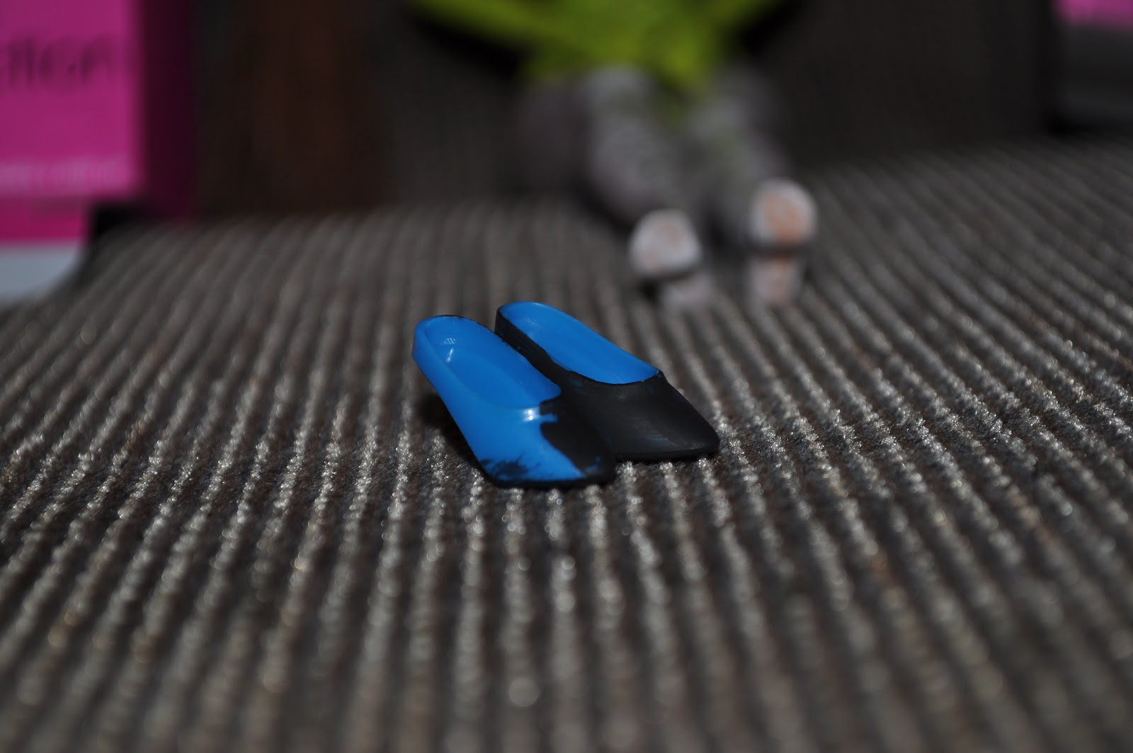
This is Hazel after removing the dress, with the dress, shoes & box I chose to work with. Her broom was already completed.


This is Hazel after removing the dress, with the dress, shoes & box I chose to work with. Her broom was already completed.

Close up of shoes I had begun to work on:
Painted fingernails!

The dress I chose work with, which I covered in black paint & then sparkly finger nail polish, sounds weird, but looks super cool.

Supplies to paint my box (I chose to do it this way just for cost. This box & the doll inside cost 3.00 at Big Lots. I was able to take the dress off the doll, the shoes & the box & discard the doll cheaper than if I would have tried to print out the box with the plastic acetate.)

Here is an in-process shot of the box. Trust me, it turned out better than I expected!

Here is a shot of the charm guide. I started with the old photo template I created for baby ampersand & modified it in PS w/ the clone tool, the burn tool & C/P.
Here is an in-process shot of the whole thing. It will have the charm guide on one side & the tips/tricks on the other, with the gift card at the bottom. The charm guide is pixelated right now, I am going to have to redo that text by hand.

My bubble gum wrapper with the text: (I also added ingredients & the BWS logo, but I was already uploading as I continued to work):

Witch's Brew Bubbles (same story as the bubble gum):

And this is the play scene. I hope to get it laminated, or onto something that will convey the idea I have. We'll see if it happens before Thursday!! :)

I've put a lot of work, a lot of time & a lot of effort in to this project, but its been the most fun I have had on a project in quite a while. I've really loved this assignment & I hope the final product conveys how enriching I've found this whole experience to be! It was really nice to be able to use some techniques and skills that I hadn't utilized in a really, really LONG TIME & to find out they had some practical use after all!
Monday, October 1, 2012
Since Thursday I have been working on my Launch Kit. I decided I am going to be making a "Bublle Witch" doll, and am super excited about it. I wanted to make the doll green, but unfortunately my attempts to dye the whole doll did not pan out. I tried a few different things, and only ended up dying the crease of her neck! I gave up, lol and moved on to paint. I really liked the effect of the paint and I am going to stick with it. I was also able to find a cauldron at the Dollar Tree (SCORE), not as nice as the one I foudn online, but about 11.00 dollars cheaper, so there ya go. I was also able to find the perfect jar and gum balls for my "potion jar" bubble gum & found the perfect purple bubble container for my Witch's Brew bubbles. I also procured a bottle of green & black nail polish, but labels will have to be made for them as all attempts to remove the labeling on them has failed. I also came across a witch's hat I really liked, but am unsure how or if I will use it. All ina ll its been very productive. I also spent some time working on my labels further, but am stymied by the search for a font. I couldnt uncover a "Bubble Witch" font, and while I found some i liked, when i added them to my label I wasn't so hot about them anymore. I have some screen shots below of my progress:

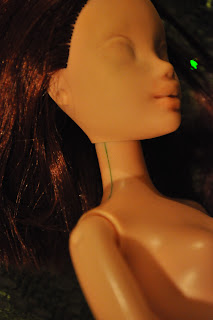


Here is the My Scene doll donated by my wonderful daughters, I have removed her factory face paint & am optimistic about dying her green!

Optimism misplaced: plastic body resists my dying efforts, but creases in neck are green!!

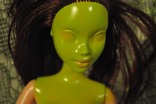
I went ahead with my green plan & painted the face & upper torso green. Her hands & lower arms will also get painted this same color of green.

Just another angle. I cheated by choosing a doll that already had red hair! Her legs I am going to try and paint with black & white striped to simulate striped stockings.

This is the image I started off with, taken from a Bubble Witch fan site.

I used content aware & the clone tool to get rid of the witches and make a clean template to work with. I had this done in class before I left on Thursday.

Over the weekend I moved the to the middle and fleshed out the tree to be "whole" using content aware & the clone tool.

I sticthed together a few more panels and made the label longer for my bubble container. I was able to single out the word "witch" but looking for a matching font has been a problem so far.
Tuesday, September 25, 2012

Monday, September 24, 2012
So, here I am! :) Sadly I missed last weeks blog post (wi-fi wouldnt co-operate with me), but Im here now! Ive spent my time wisely working on this lauch kit assignment, and Im really excited about my ideas. Im sure no one remembers my game which was (the) Bubble Witch Saga. I researched the game (I may have in the past YOUTUBE-d some video to help me "defeat" a level) and found there is lots and lots of content out there, fan pages, etc to help you advance through the levels, but not any backstory about the characters, mainly the witches. Not that I could find, anyway. Here are some to help anyone who hasn't ever played get a feel for the game:


Bubble Witch Sage is -extremely- addicting & fairly difficult once you get upwards in levels, and even before this assignment I was -shhh- level 49. For me to get committed to a game (especially a VIDEO game) is extrememly rare. I am going to admit, here, on my blog... once upon a time, I was a fairly serious tabletop gamer (role player, yes I admit it!!!) But computer games, video games, etc never really appealed to me. But (the) Bubble Witch, oh I do love it. After several straight days of playing Im still.. maddeningly enough, level 49. Im haunting by the things I have done for an extra life, but so far I have resisted the urge to pay for anything (like charms, spells, extra bubbles, etc). BUT... if there were something like a launch kit offered for this game, and it included items such as:
 -a special edition "Bubble Witch" Doll
-exclusive bonus outfit w/hat, broom & shoes
-Witch's Brew Bubbles
-"Witchy" Bubble Gum either in a pack or
- Collectors Edition Potion Jar
- TEN DOLLARS of BUBBLE WITCH "CASH"
- BONUS "cheat" codes, special "hidden" level codes, etc
- ALL IN A COLLECTOR'S BUBBLE WITCH SAGA CAULDRON
I'd be all over it. Its my own idea and I'm so excited I want to run out and sit in front of Game Stop like it's Black Friday.
Now, the next question? How much of this is feasible? Well, all of it. Many years ago, waaaay back before I decided to put the nebulous idea of going back to school into action, I was really into Barbie collecting & OOAK dolls. That meant I liked to collect Barbies and also take them, strip them of make-up and recreate them in my own way. I've rewigged Barbies, re-painted them, re-outfitted them, etc. Its not easy, but I'm excited to make my own "Bubble Witch" doll. And outfit. Thats going to be the more idfficult part, but Im willing to work through it. The bubbles, "gift certificate" and codes shouldn't be too difficult, nor should the bubble gum package for the bubble gum sticks. The gum balls & potion jar might present more of a challenge, but I haven't decided which I am going to attempt. The Witch's Cauldron to put everything in... well, Halloween is in a little over a month, so that shouldn't be too difficult to find (a plastic one of course). There will of course be some type of label or wrap on the cauldron, or it may end up painted, etc.
I'm so excited I already started trying to dye a Barbie green, like any good witch should be!

Bubble Witch Sage is -extremely- addicting & fairly difficult once you get upwards in levels, and even before this assignment I was -shhh- level 49. For me to get committed to a game (especially a VIDEO game) is extrememly rare. I am going to admit, here, on my blog... once upon a time, I was a fairly serious tabletop gamer (role player, yes I admit it!!!) But computer games, video games, etc never really appealed to me. But (the) Bubble Witch, oh I do love it. After several straight days of playing Im still.. maddeningly enough, level 49. Im haunting by the things I have done for an extra life, but so far I have resisted the urge to pay for anything (like charms, spells, extra bubbles, etc). BUT... if there were something like a launch kit offered for this game, and it included items such as:

-exclusive bonus outfit w/hat, broom & shoes
-Witch's Brew Bubbles
-"Witchy" Bubble Gum either in a pack or
- Collectors Edition Potion Jar
- TEN DOLLARS of BUBBLE WITCH "CASH"
- BONUS "cheat" codes, special "hidden" level codes, etc
- ALL IN A COLLECTOR'S BUBBLE WITCH SAGA CAULDRON
I'd be all over it. Its my own idea and I'm so excited I want to run out and sit in front of Game Stop like it's Black Friday.
Now, the next question? How much of this is feasible? Well, all of it. Many years ago, waaaay back before I decided to put the nebulous idea of going back to school into action, I was really into Barbie collecting & OOAK dolls. That meant I liked to collect Barbies and also take them, strip them of make-up and recreate them in my own way. I've rewigged Barbies, re-painted them, re-outfitted them, etc. Its not easy, but I'm excited to make my own "Bubble Witch" doll. And outfit. Thats going to be the more idfficult part, but Im willing to work through it. The bubbles, "gift certificate" and codes shouldn't be too difficult, nor should the bubble gum package for the bubble gum sticks. The gum balls & potion jar might present more of a challenge, but I haven't decided which I am going to attempt. The Witch's Cauldron to put everything in... well, Halloween is in a little over a month, so that shouldn't be too difficult to find (a plastic one of course). There will of course be some type of label or wrap on the cauldron, or it may end up painted, etc.
I'm so excited I already started trying to dye a Barbie green, like any good witch should be!
Monday, September 10, 2012
So since Thursday I have been working on my empty book project. I decided to go with the "&" because, honestly, I really love the ampersand. Its a story Ive always found fascinating, but not so much anyone else Ive ever shared it with.. so a "Thrilling Tale", its not. For most, anyway. For those who don't know, & used to be considered the 27th letter of the alphabet and was placed behind the "z". (Your eyes are already crossing with boredom... you dont care where the & used to be, I know!) Four years of Latin taught me "et" translates as "and", and the ampersand is a ligature mark of the letters "E" and "T". You always knew it, even though you didnt know you knew it... almost everyone writes "and" by making a mark that on close inspection... it looks like an "e" and a "t"!
If you want to know more about the real story of ampersand, heres the wiki link:
http://en.wikipedia.org/wiki/Ampersand.
http://en.wikipedia.org/wiki/Ampersand.
Otherwise, back to my project, which is what you folks are really interested in (Im assuming!)
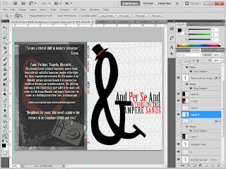
So I started with this idea of poor &, all alone in his big, old mansion, forgotten by the whole world. He used to be SOMEBODY, the 27th letter and now he's... well, he's just something lazy people use in text messages. And not even, now they just use "n". How far the mighty have fallen! So my cover is just going to be a large &, maybe with a top hat and a sparse title. But lots more work went into this book cover than that. I needed a font that said... avant garde and lost grandeur, that conveyed the feeling of old money & cobwebs. I settled on Birch Standard after roadtesting a MILLION fonts it felt like. I wanted a "thinner" body on the &, and I wanted to achieve it without warping the letter in PS. Also I want on the back a portrait of good ol' & in his glory days, along with a photo of him with dear ol' Mom.
I have most of this finished, except for the portrait. I also have it on both a white background w/black text & white brackground with the text knocked out. I also am tossing around the idea of making part of the text red.
Here's where I started from:

Yes, thats a photo of my grandmother in front of the Fuquay Springs High School. Fascinating, right?

And here, you have a blank template. I used PS and made just a blank, vintage photo background. Guess whats going to go here? Baby &, you got it!

Look!! Its baby Ampersand and his dear ol' Mom. Yes, when Ampersand was a baby, he was in fact Garamond. Good eye! Anyway, I spent a while on this... all the elements are crafted out of Garamond typeface letters, regular and italic. I messed with it a bit, making sure all of the nice vintage-y parts really came through.

And this is what I have so far, on the white background. (Disregard that hat, Im going to make one of my own, its just a place holder for now).

I really love the black one, although I think Mr. Persand looks thinner on the white. Also, I think if I choose the black, a pop of red (whether from a hat or text) is going to be necessary. I actually love it, so far... but what does everyone else think?
(On the back there will be a wood portrait of &).
Subscribe to:
Posts (Atom)