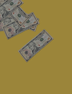
Again. not the best week--Ive been sick, among other things. I spent sometime working my TOWER OF CASH concept, but I couldnt really get the graphic like I wanted it. I, obviously, don't have a tower of cash, but while I was on the ship, they had a really nice photo of one right in front of the casino (go figure!), and I spent a lot of time on Promenade drawing my sketches for this assignment, being very inspired by that Tower Of Cash sign. I even had to take a photo of it during a digital scavenger hunt I OWNED (and have gold trophy to prove this fact..although I should mention it was a team effort, thanks Sarah!). Unfortunately those sketches never got posted to this blog, various reasons, one being WIFI in the middle of the Atlantic is a pain, so I was really upset when I got home and realized I had left my sketchpad.. and all my semesters worth of sketch...back in Miami in R1212. Hmm. Very little chance I'll be getting that sketchbook back, but... I had the tower of cash photo! Yay. Except, I'm not happy with that graphic, so I decided to move on. I working now with a background of 10.00 bills that I photographed twice, one with my flash & one without to get a subltle color difference, and then stuck in PS and used to make a background. I did my research and found that EcuyerDAX is the closest font to what's on the dollar bill, so I DL'd it & will be using it for some of the text on my flyer. I'm pretty sure that dollar bills are going to attract anyone's attention, and I immediately liked the effect better than the whole Tower of Cash thing. Although, Im not (IN ANY WAY) hating on towers of cash. Ya know, just in case anyone who reads this want to give me one. Here are some photos to explain my process a little better.
Here are my two "money shots":
(no flash)
(with flash)
I used PS to select that first w/flash 10.00 bill and start building my background.
Then I decided, wow thats borning. We need some variety! So I went and grabbed my 10.00 bill without the flash, which has a yellower cast to it, and added that between my layers.
Yellower 10.00 has been added for variety!
I just spent some time adding each bill to its own layer, twisting it w/ free transform and just getting the background to have the layered look i wanted it to have. This is a great background to just save & reuse in the future, for.. idk, but Im sure I'll be glad I kept it when I figure out what else I will need it for.
Looks good, right? I thought so too. Then I went over and DL'd that font I needed: EcuyerDAX from dafont.com.
Afterwards, I went to PS, took all my bills and threw them in a group all together, so each layer is still individually editable, but the PS file is now MUCH MORE organized. I also lowered the opacity for the whole folder to 75%.
And here's where I am right now. Background & main text added, I just have to meet the other requirement as far as information is required & add the QR code & logo for the site.
I do! I do!


No comments:
Post a Comment